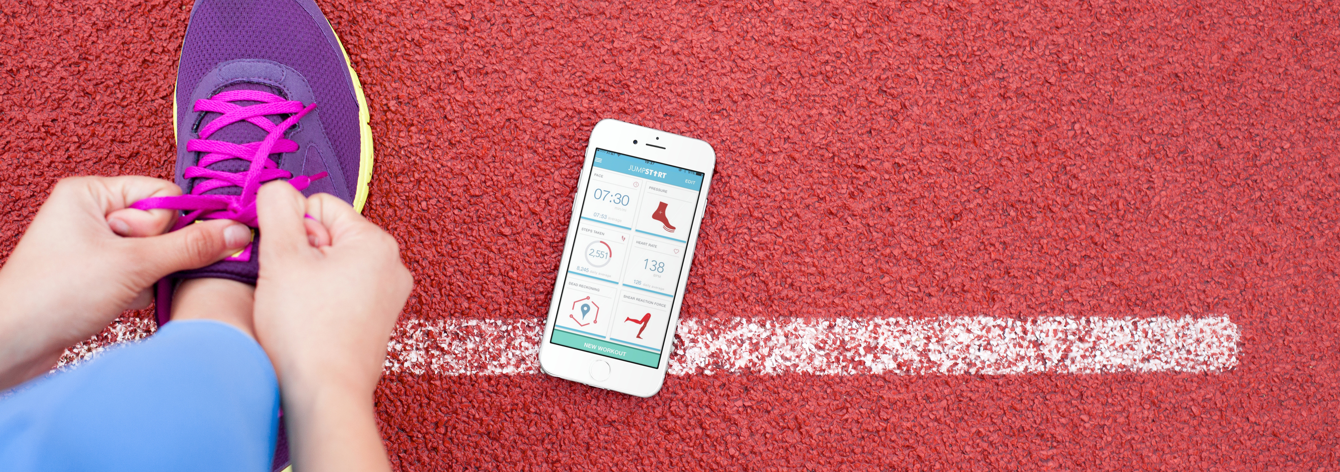
A complete design of customer's mobile app, focusing on latest wearable tech design trends and great user experience for JumpStartCSR's users.
JumpStart is an early-stage biotech startup that approached us with a project: design the accompanying iOS mobile application for an intelligent shoe insert that collects health, wellness, and fitness data. While working within a single 3-week design sprint, our team focused on structure and scalability to provide the client with the foundation for an app that can grow with their product and company.
I took ownership of the project’s concept mapping (IA), navigation schema (sitemap and user flow), and competitive analysis. I shared responsibility in the process of performing the stakeholder interview, user interviews, persona development, wireframes, user journey, visual design and usability tests.
The Challenge: Researching wearables, understanding clinical terms, and identifying the main players was an initial challenge.
While my teammates interviewed subject matter experts (SMEs) I interviewed five (5) users with a variety of fitness levels. After our first round of interviews, we did not feel as though we had enough information to form a persona hypothesis. To further our research, we visited the University of Washington campus. We applied Guerilla research tactics to interview 5 athletes who were either starting or finishing up a work out. Our focus was on early adopters of wearable technology.
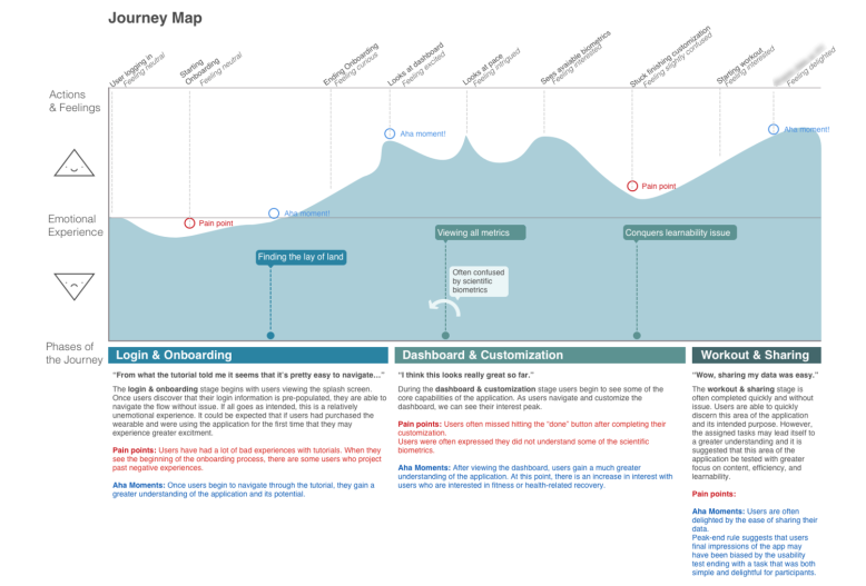
Based on touch points, we asked users what wearables and fitness apps they use, how they use them, when they use them, and why. Data collected was combined into a research summary consisting of the Heart Framework and the RITE Method.
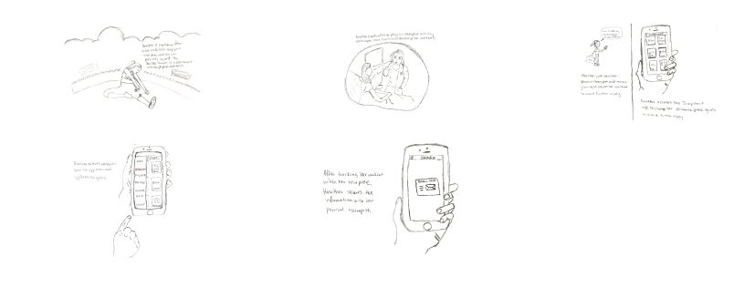
The storyboard below shows our persona feel pain flair up in her leg from a repetitive stress injury after running. She visits her physical therapist and is advised to reduce her work outs and track her progress on the JumpStart app. Heather updates her workouts and sends her progress to her physical therapist via the app's email function.
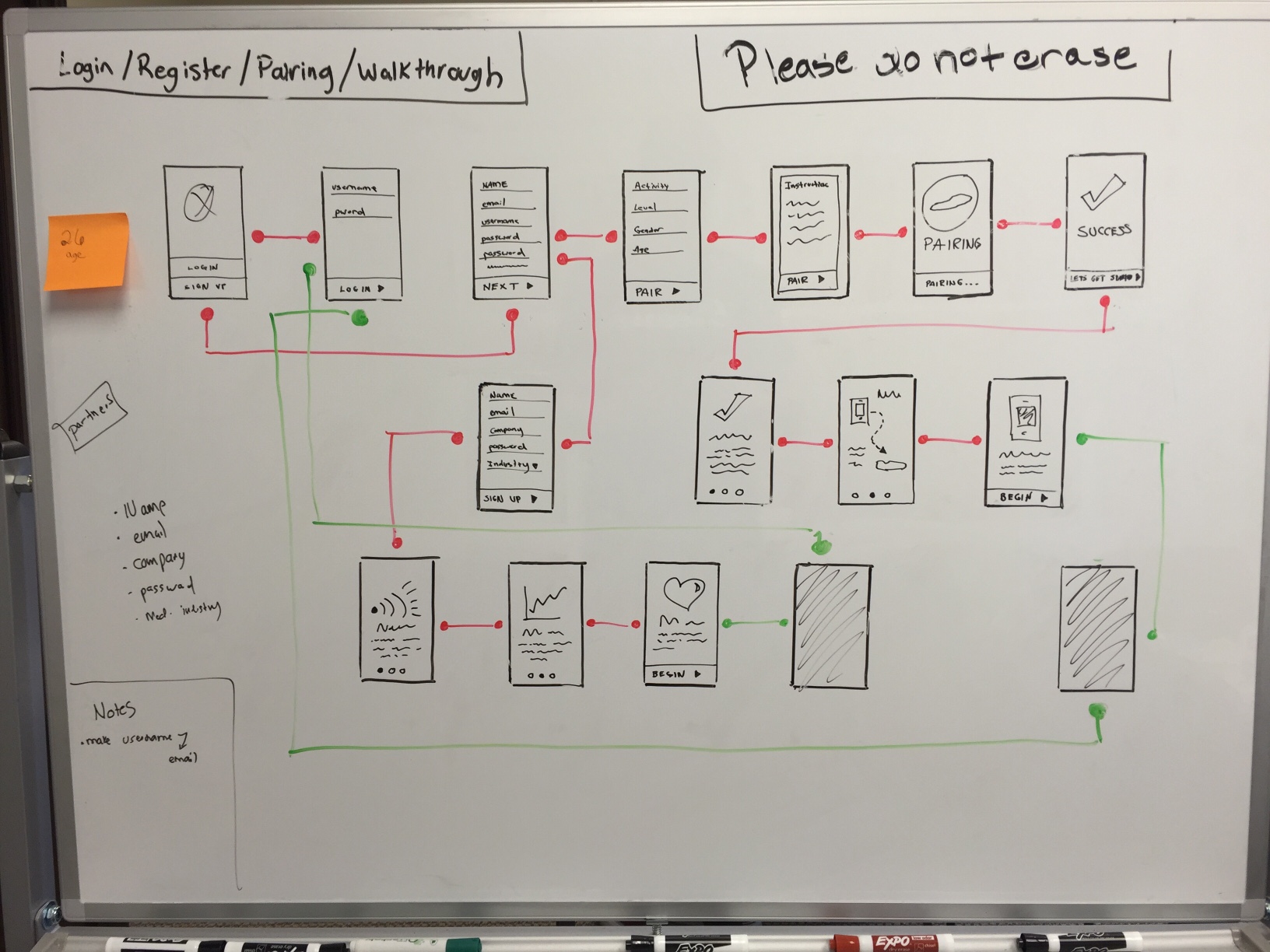
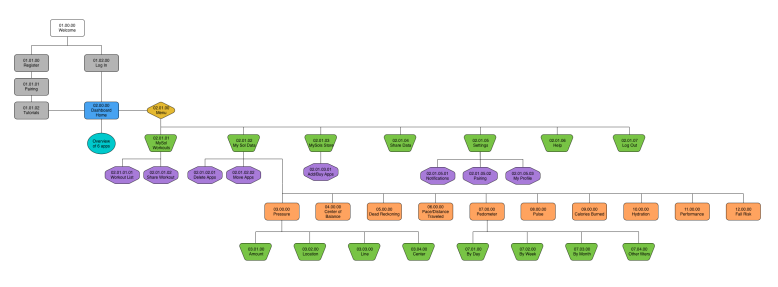
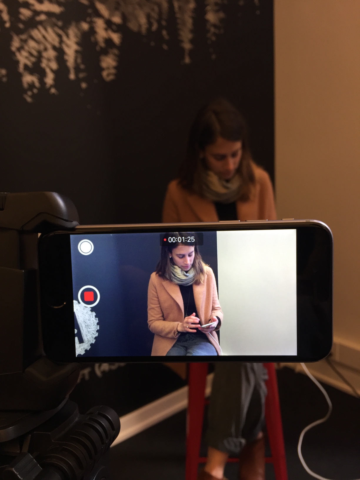
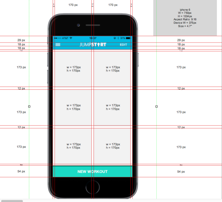
Whiteboarding the wireframes helped us to visually communicate our concepts with users and generate the user flow.

In medical product design, trends are far less important. In this industry, color needs to be used to achieve three objectives:
We had to be certain we chose colors that the patients/users trusted and colors that seemed intelligent and precise for the SME'S. This is because part of our users emotional response to color has to do with the symbolism that certain colors have come to be associated with in the medical industry. In this industry, “Appeal” doesn’t mean what colors do they like. It means what are the characteristics and values the user will associate the product with.
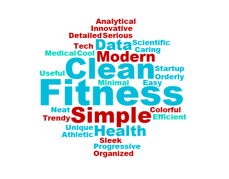
I conducted moderated usability tests on the final application. During our usability tests, users were asked to choose words they felt best described the application overall.
We used this data to create a word cloud and validated our three objectives.
All in all, our clients were very impressed with how easy the app was to use. They were also happy to get an effective prototype that would advance their project. In the end, the mobile application we built was used by the JumpStartCSR executive team to successfully procure funding for further design and development.
Are you working on something great? I would love to help make it happen! Drop me a note and start your project right now!
Address Remote, United States